Why Emojis Look Different on Android and iPhone: Apple vs Google vs Samsung
July 22, 2026 · Bas Hennekam
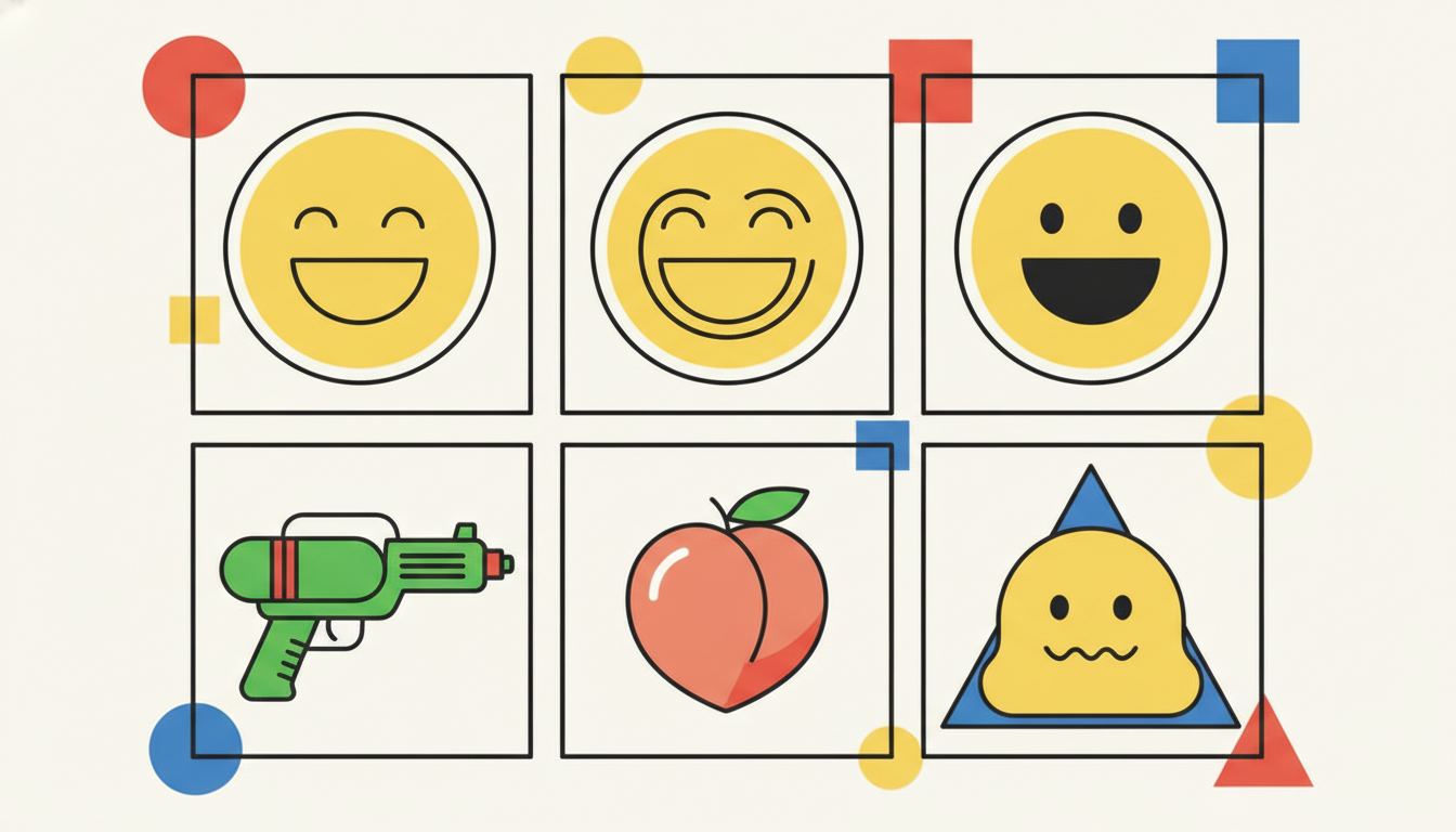
You send a friend a cheerful 😁 from your iPhone. On their Android phone it can land as something that looks strained or even pained. Nothing went wrong with the message. The two of you are simply looking at two different pictures of the exact same emoji. Every emoji has one shared identity in the Unicode standard, but each platform draws its own artwork, and those drawings do not always agree. 🎨
One Standard, Many Faces
An emoji is not an image that travels with your message. It is a code point, a small number defined by the Unicode Consortium. When you type 😂, your phone sends the code point U+1F602, and the receiving device decides how to paint it. Apple renders it one way, Google another, Samsung another still. As of Unicode 16.0, released in September 2024, there are around 3,790 emojis in the standard, and every single one gets a separate illustration from each major vendor.
That is why the same emoji has many faces:
- Apple ships its designs through iOS and macOS, and because iPhones are so common, Apple's glossy 3D style is what most people picture when they think "emoji"
- Google uses its Noto emoji set across Android, Gmail and Chrome
- Samsung draws its own set for its One UI skin on Galaxy devices
- Microsoft ships a distinct set in Windows, and open-sourced its colorful 3D Fluent emojis in 2021
- WhatsApp, X (formerly Twitter) and Facebook each render their own artwork inside their apps, regardless of the phone you use
So the picture you see depends on two things: the device and the app. A WhatsApp message shows WhatsApp's emojis even on an iPhone. 📱
When the Differences Cause Real Problems
This is not just a cosmetic quirk. A widely cited 2016 study from the University of Minnesota's GroupLens lab asked people to rate the sentiment of the same emoji as rendered by different platforms. The results were striking. For Apple's version of "grinning face with smiling eyes" 😁, many people read it as negative, while Google's version of the same code point was read as clearly positive. On average, when two people looked at the same emoji on different platforms, their sentiment interpretations differed by more than a full point on the study's scale.
That gap means a message meant as warm can arrive as cold, and a joke can read as an insult, purely because of which phone each person holds. When you add the fact that people already disagree about emoji meaning even on the same platform, cross-platform rendering becomes a real source of misfires. 😬
The Famous Divergences
A few emojis became legendary for how differently they appeared across platforms.
The pistol that became a squirt gun 🔫
In 2016 Apple redesigned the pistol emoji from a realistic revolver into a bright green water gun. For two years there was a jarring split: an iPhone user sending a harmless water pistol could have it appear as a real firearm on Android, Samsung and Windows. By 2018 every major vendor had followed Apple's lead, and today the toy gun is universal. It is the clearest example of a design choice rippling across the whole industry.
The peach that was almost redrawn 🍑
When Apple tested a more literal, less curvy peach in a 2016 beta, users protested loudly because the fruit had taken on a second life as slang. Apple reversed course before release. The episode showed that vendors do not design in a vacuum. Cultural usage pushes back on the artwork.
Google's blobs 👋
For years Google's emojis were not round faces at all but yellow "blobs" with a distinctive lozenge shape. They had a devoted fan base. Then Android 8.0 Oreo, in 2017, replaced them with conventional round faces to match the rest of the industry. The backlash was strong enough that the blobs live on today as a downloadable sticker pack, a rare case of users mourning an emoji redesign.
Samsung's outliers 😃
Samsung long drew several faces in ways that clashed with everyone else. Its "grinning face" once looked almost anxious compared to Apple's happy version, and its cool-face and other expressions carried different emotional weight. Over successive One UI releases Samsung has steadily nudged its set closer to the shared look, reducing the mismatches that used to confuse Galaxy users.
Why Vendors Do Not Just Copy Each Other
If differences cause confusion, why not standardize the artwork too? A few reasons keep the designs apart.
First, Unicode standardizes meaning, not appearance, on purpose. The consortium describes each emoji in words and leaves the drawing to vendors, the same way a font designer decides how the letter "a" looks. Second, emoji design is a branding surface. Apple, Google and Samsung use their sets to express a house style, and Microsoft's move to expressive 3D Fluent emojis was explicitly a design statement. Third, open-source sets like Google's Noto and the Twemoji library (which powers many websites and apps) let smaller platforms adopt a ready-made look, which actually multiplies the variety in the wild rather than reducing it. 🌍
How to Communicate Across the Divide
You cannot control which emoji your reader sees, but you can lower the risk of a misread:
- Lean on the clear ones. Hearts ❤️, thumbs up 👍 and the classic laughing face 😂 render consistently and carry stable meaning across platforms
- Be careful with subtle faces. The slightly ambiguous smiles and grimaces are exactly the ones that shift most between vendors, so pair them with words when the tone matters
- Add context. A short phrase around an emoji anchors your meaning no matter how it is drawn: "so happy for you 🥹" is unmistakable in a way a lone face is not
- Preview when it counts. For marketing copy or anything high-stakes, check how your emoji looks on Emojipedia, which shows every platform's version side by side
The Trend Toward Convergence
The good news is that the gaps are slowly closing. Vendors increasingly react to viral moments together, ship new Unicode sets on similar timelines, and quietly align their most misread designs. The water-gun episode showed the industry can move as one, and Samsung's gradual harmonization shows the appetite to reduce friction.
Complete uniformity is unlikely and probably undesirable, since the variety is part of what makes emojis feel alive. But expect the worst mismatches to keep fading. Check back Friday, when we look at how the newest Unicode 17.0 emojis are rolling out across those same platforms, and which one drew them best. 👀