Emoji Color Psychology: What Every Color Really Signals
June 12, 2026 · Bas Hennekam
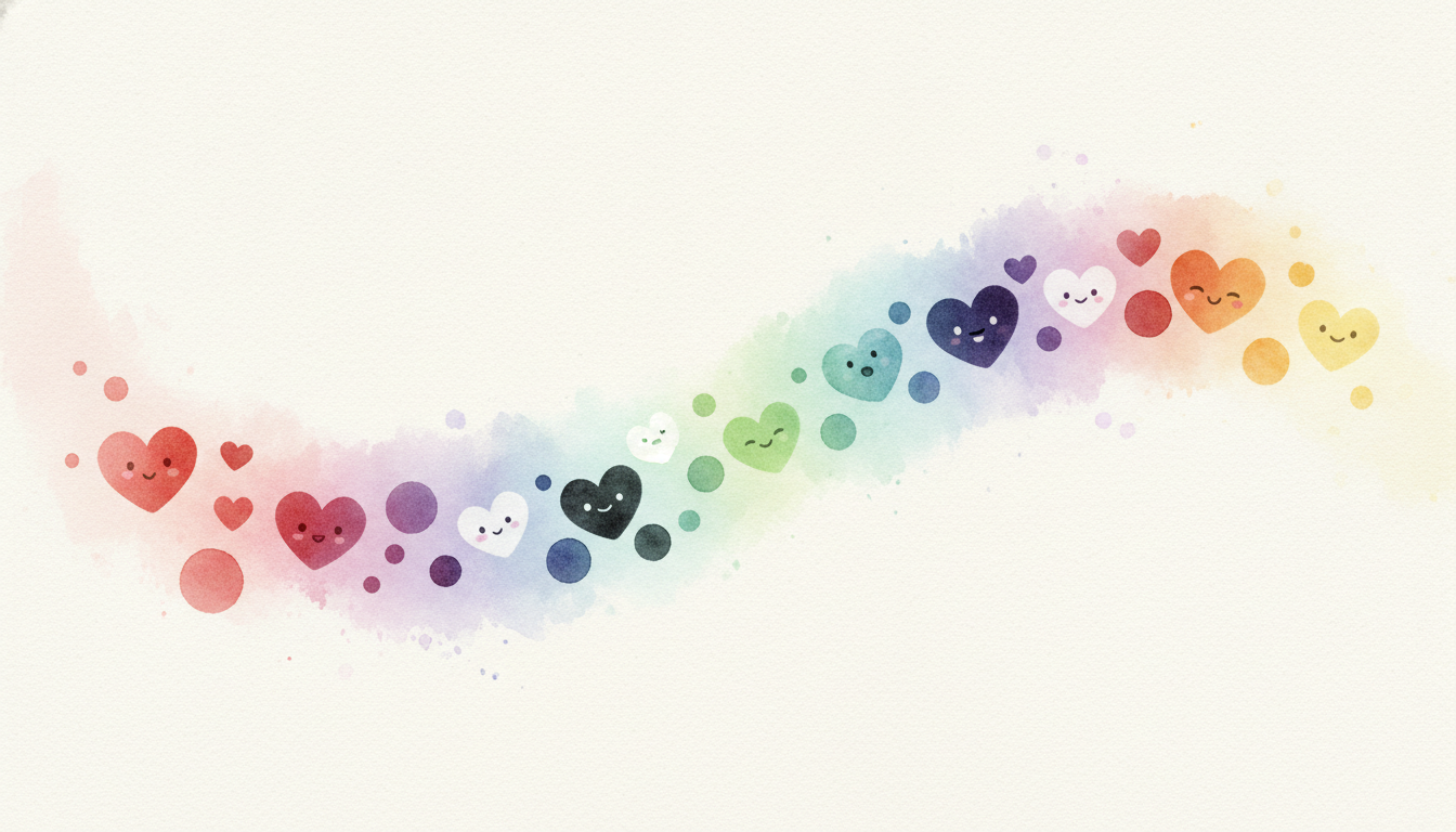
Swap a red heart for a black one and the message changes completely. ❤️ reads as warm and sincere, while 🖤 lands as edgy, ironic, or grieving. The words around it never moved, but the color did all the work. Emoji color is one of the most underrated signals in digital communication, and it follows surprisingly consistent psychological rules. According to Adobe's 2025 Emoji Trend Report, 88% of users say emoji help them feel more connected to the person they are talking to, and color is a big part of why. This guide breaks down what each emoji color actually signals, where those meanings come from, and how they shift across generations and cultures.
Why Color Carries So Much Meaning
Color psychology is older than emoji by centuries. Marketing research has long shown that color drives up to 90% of snap judgments about products, according to a frequently cited study from the journal Management Decision. Our brains attach emotion to color before we consciously process anything else, so when a colored emoji lands in a chat, the hue registers first and the shape second.
Emoji amplify this because they are tiny and repeated. A single 🔴 in a status update reads as urgent. A 🟢 reads as "all clear." We have absorbed these codes from traffic lights, dashboards, and apps, and we carry them into messaging without thinking. The result is a shared, mostly unspoken color grammar. 🎨
Warm Colors: Energy, Passion, and Attention
Warm colors pull the eye and raise the emotional temperature of a message.
- Red ❤️🔴🟥. The loudest color in the set. Red signals love, urgency, passion, or warning depending on context. A red heart is affection, a red circle is "stop" or "live now," and a red square often marks something blocked or critical. Red gets noticed first, which is exactly why people reach for it when something matters.
- Orange 🧡🟠. Warmth without intensity. Orange reads as friendly, cozy, and energetic. Sports fans use 🧡 for team identity, and brands use orange to feel approachable rather than aggressive. It is the color of comfort food and autumn aesthetics. 🍂
- Yellow 💛🟡. Optimism, friendship, and sunshine. Yellow is the most cheerful color in the palette, though platform rules can override the general meaning. On Snapchat, 💛 specifically marks your number one best friend, which has trained millions of users to read it as a closeness signal rather than just happiness.
Cool Colors: Calm, Trust, and Growth
Cool colors lower the temperature and read as steadier and more deliberate.
- Green 💚🟢🟩. Growth, nature, safety, and "go." Green has shed most of its old association with envy and now skews positive: sustainability, wellness, plant life, and approval. A 🟢 means available or online across countless apps, making green the universal color of permission. 🌱
- Blue 💙🔵🟦. Trust, loyalty, and calm. Blue is the most "safe" color and the least likely to be misread. It anchors cause campaigns like autism awareness and mental health initiatives, and it works as a platonic alternative to the romantic red heart. Blue rarely offends, which is why corporate branding leans on it so heavily.
- Purple 💜🟣🟪. Creativity, luxury, and fandom. Purple historically signaled royalty and glamour, and today it carries strong subculture meaning. The phrase "I purple you" turned 💜 into a global symbol of devotion among music fans, and purple remains a staple of Pride and creative content.
Neutrals: Subtlety, Edge, and Identity
Neutral colors say less on the surface and more underneath.
- Black 🖤⚫⬛. Edge, elegance, dark humor, and mourning. Despite the somber color, 🖤 is rarely hostile. Gen Z uses it affectionately and ironically, and it dominates minimalist, goth, and alt aesthetics. A black square ⬛ famously became a protest symbol in 2020, proving how much weight a single colorless tile can carry.
- White 🤍⚪⬜. Purity, simplicity, and remembrance. White reads as clean and minimal, common in wedding content and tributes. It is the quietest emoji color, often chosen precisely because it says so little.
- Grey 🩶. Neutrality, melancholy, and understated feeling. Added to Unicode in 2023, the grey heart has become popular in poetry-style posts and muted aesthetics where bright color would feel like too much.
- Brown 🤎🟤. Warmth, earthiness, and identity. Since 2020, 🤎 has been widely used to celebrate Black culture and brown skin, alongside coffee and cozy autumnal content.
Beyond Hearts: The Colored Shapes
The colored circle and square emoji 🔴🟠🟡🟢🔵🟣⚫⚪🟤 are pure color with no other meaning attached, which makes them the cleanest test of color psychology. People use them as status indicators, ratings, and visual shorthand. A row of 🟢🟢🟢🔴 instantly reads as "three good, one bad" with no words at all. Sports communities use colored circles for team scarves and predictions, and project teams use them as informal traffic-light status reports. Because the shapes are identical, every bit of meaning rides entirely on the hue, which is why they are the purest demonstration of how strongly we color-code emotion and judgment.
Color Meanings Shift Across Cultures
Color psychology is not universal, and the same emoji can flip meaning across borders. 💚 carries Irish identity in March, national pride in several Gulf countries, and religious significance in parts of the Islamic world. White signals weddings and celebration in much of the West but is associated with mourning in parts of East Asia, so 🤍 can read very differently depending on the audience. Red means luck and celebration in China, where 🔴 and red envelope 🧧 imagery dominate Lunar New Year, while in Western dashboards red still means danger. When you communicate across cultures, lean on the safest, least ambiguous colors: blue and the plain red heart travel best.
Practical Takeaways
A few rules help you pick the right color on purpose:
- Match hue to intent. Warm colors raise energy and attention, cool colors signal calm and trust, neutrals add subtlety or edge.
- Respect platform codes. 🟢 means available, 🔴 means urgent, 💛 means best friend on Snapchat. These app-trained meanings often override general psychology.
- Default to blue or red when unsure. They are the least likely to be misread across ages and cultures.
- Use neutrals deliberately. 🖤 and 🤍 carry real emotional weight in posts about loss, identity, or aesthetic, so save them for moments that earn them.
Looking Ahead
As Unicode keeps expanding its palette, color choice will only get more expressive. Requests for new shades like silver, peach, and lavender sit high on proposal lists, and messaging apps are adding subtle color animations to existing emoji. Expect color to keep doing the quiet heavy lifting in our messages, carrying tone, urgency, and identity in a single saturated character. Choose your colors with intent, and your emoji will say exactly what you mean. 💙